![]() AMEA requested the inclusion of the state of Alabama in its new logo, along with some musical symbology. Overlaying the beautiful, but oversized shape of the Treble Clef, created some positive and negative space, while still keep the symbol recognizable. The pieces that remained allowed for some creative colorations, but red, white and blue were the ultimate choices, keeping the logo clean and well defined.
AMEA requested the inclusion of the state of Alabama in its new logo, along with some musical symbology. Overlaying the beautiful, but oversized shape of the Treble Clef, created some positive and negative space, while still keep the symbol recognizable. The pieces that remained allowed for some creative colorations, but red, white and blue were the ultimate choices, keeping the logo clean and well defined.
Five Resolutions for a Better Band in the New Year
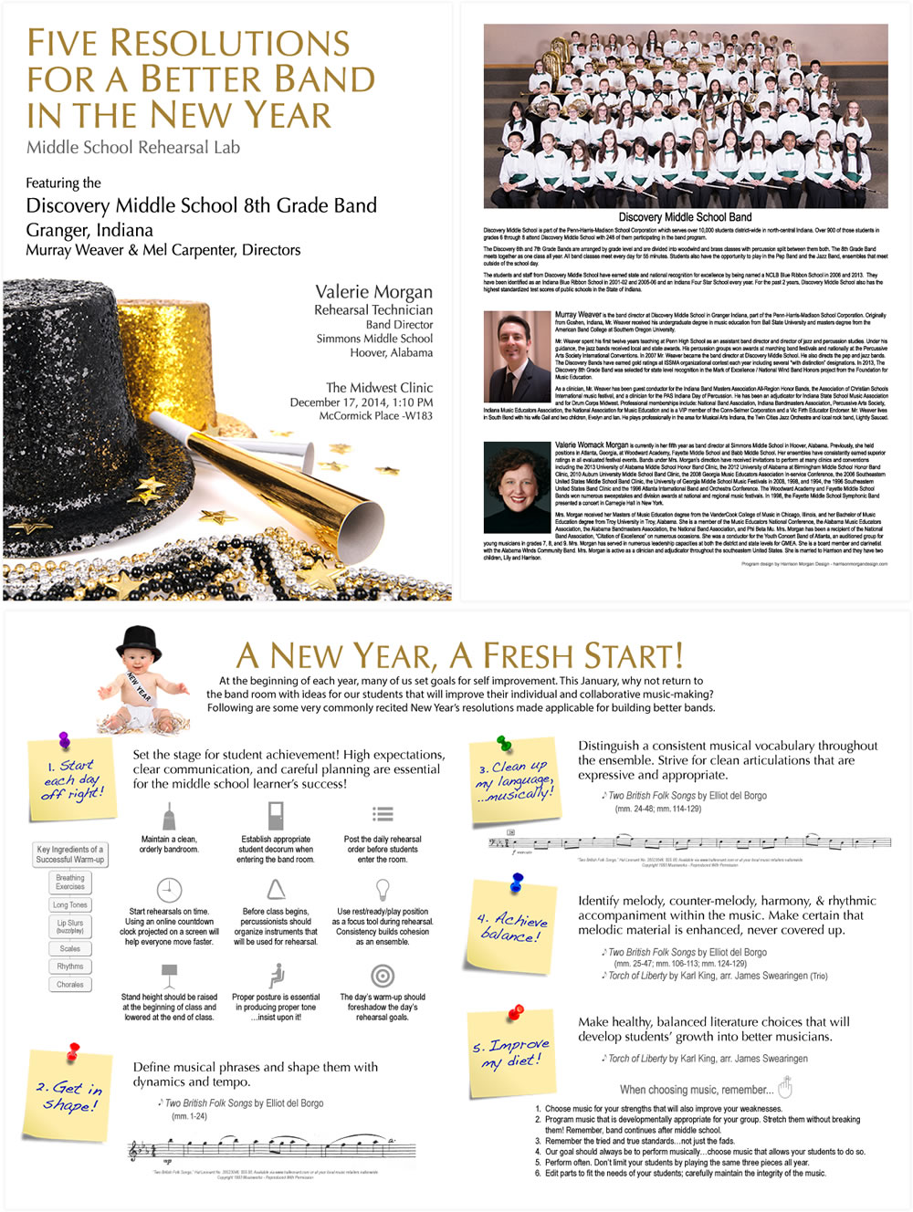
Band director and clinician Valerie Morgan presented a Middle School Rehearsal Lab at the prestigious 2014 Midwest Band Clinic in Chicago. Well over 400 attendees enjoyed this entertaining and informative program that took a new twist on New Year’s Resolutions. Each commonly made resolution was repurposed towards improving musical performance skills, repertoire selection and building best practices in the rehearsal setting.
The program we designed reflected the festive atmosphere of New Years, from party hats, beads and party horns in the cover photo, to the welcoming arms of Baby New Year on the inside pages.
We used a two page spread for the inside layout and pinned each resolution on illustrated, handwritten post-it notes. Each segment utilized custom graphics and reprinted excerpts, all to help illustrate the concepts being covered in the presentation.
Alabama Winds
![]() Alabama Winds is a community band comprised of professional and amature musicians and music teachers. The logo is clean and simple and makes use of negative space and positive shapes to create the image of an eighth note.>
Alabama Winds is a community band comprised of professional and amature musicians and music teachers. The logo is clean and simple and makes use of negative space and positive shapes to create the image of an eighth note.>
The wistfulness of the letter “W” provides movement and a “windy” feel. The more traditional serif typography of the ensemble name conveys a feeling of formality, perfect for a group that performs serious musicial literature.
Hoover Band Program
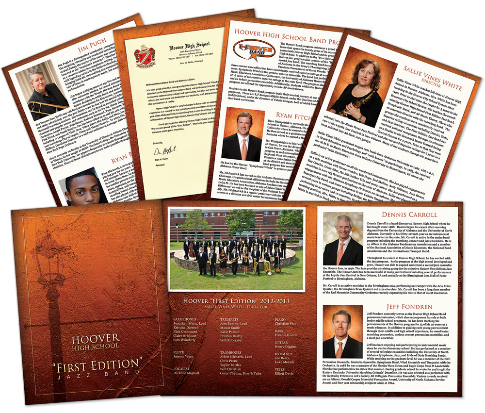
We created their 16 page program that featured information about the band, the teachers and staff, guest performers and the performance selections. The school colors are orange, black and white, but we wanted a elegant look for the occasion. We found a nice stucco textured background and gave it an orange tint, just enough to connect with the school color scheme without being to loud.
The cover image features a street lamp in shadow, reminiscent of laid back evening on Bourbon Street.
Seven Deadly Sins
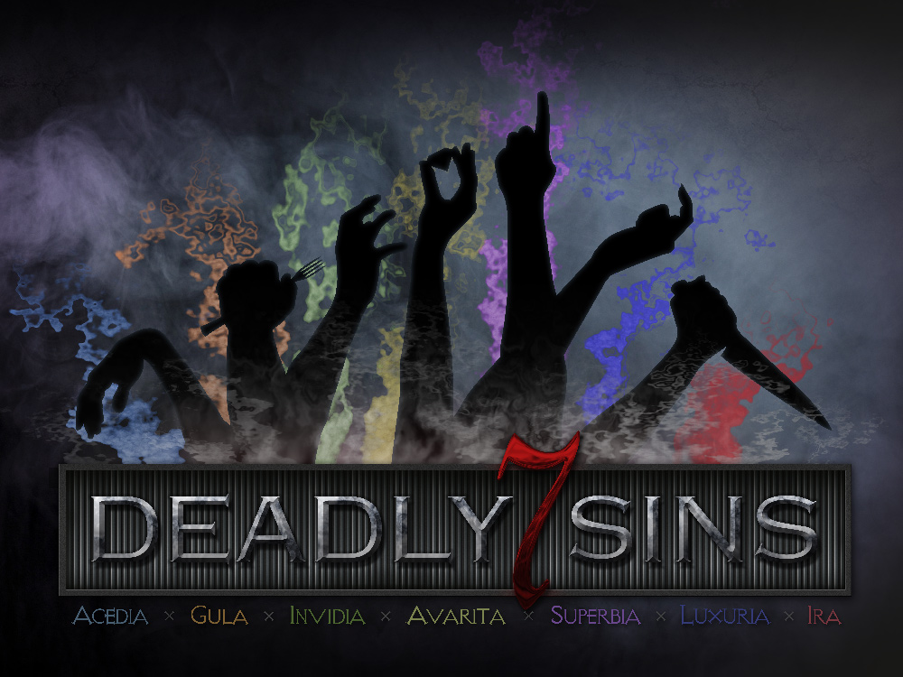
The original design featured the show’s title “Sinvitation 7”, rather than “7 Deadly Sins” in this version, layered on the industrial steel, prison-like framework containing the arms of the poor guilty souls.
Each of the arms represent one of the “deadly” sins. From left to right translated into English, they are: Sloth (the limp wrist), Gluttony (fat hand with a fork), Envy (reaching out to grab what Greed is holding, a diamond), Greed (with the gem), Pride (I’m number one!), Lust (the come hither finger) and Wrath (probably about to commit murder with the knife!)
Each sin is also often associated with a particular color, shown here in the gifts of smoke probably emanating from the fire and brimstone below. Sloth = Light Blue, Gluttony = Orange, Envy = Green, Greed=Yellow, Pride = Violet, Lust = Blue, and Wrath = Red. The Latin translation of each sin is also written in its associated color.
- « Previous Page
- 1
- 2
- 3
- 4
- 5
- …
- 9
- Next Page »