Harrison Morgan Design

Web Designer & Graphic Artist - Atlanta

  • Home
  • About
  • Website Design
  • Graphic Design
  • Services
  • Portfolios
    • Web Design
    • Graphic Design
    • Logo Design
  • Testimonials
  • Contact

Logo Design Portfolio

Spectrum

April 28, 2017 By Harrison

Spectrum’s updated logo – Click image to enlarge

Spectrum is a non-profit organization that supports the autism community in the greater metro-Atlanta area. Along with a redesign and rebuild of their website, Spectrum wanted to completely update their look from their traditional logo to reflect their outreach and available services for people with autism of all ages.

We chose to be extra bold, and as their name suggests, use a fuller spectrum of color. The puzzle motif is a traditional symbol of the autism community, so we incorporated the outlines of interconnecting puzzle pieces, which was very similar to their traditional logo, but this time with a bit more order and organization to the style and color bars.
Filed Under: Logo Design Portfolio

Alabama Music Educators Association

January 29, 2016 By Harrison

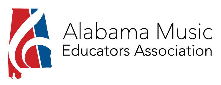
amea-logo-wide-color-750AMEA requested the inclusion of the state of Alabama in its new logo, along with some musical symbology. Overlaying the beautiful, but oversized shape of the Treble Clef, created some positive and negative space, while still keep the symbol recognizable. The pieces that remained allowed for some creative colorations, but red, white and blue were the ultimate choices, keeping the logo clean and well defined.

Filed Under: Logo Design Portfolio

Alabama Winds

October 26, 2014 By Harrison

Alabama Winds logoAlabama Winds is a community band comprised of professional and amature musicians and music teachers. The logo is clean and simple and makes use of negative space and positive shapes to create the image of an eighth note.>

The wistfulness of the letter “W” provides movement and a “windy” feel. The more traditional serif typography of the ensemble name conveys a feeling of formality, perfect for a group that performs serious musicial literature.

Filed Under: Logo Design Portfolio

Pinecroft Design Studios

October 26, 2014 By Harrison

Pinecroft Design StudiosWe selected a letterhead style font for Pinecroft Design Studios to really make this logo beautiful and decorative. We used a combination of several existing font styles, then modified the lines and swirls to make everything work well together.

The small pine cone element and green colorations reinforce the name of the business. The more formal font and bars at the bottom give the design a foundation.

Filed Under: Logo Design Portfolio

I Love Dance Logo

November 7, 2014 By Harrison

I Love Dance! - Click image to enlarge
I Love Dance! – Click image to enlarge

The I Love Dance! studio teaches young students dance techniques on site at area schools, churches and other facilities. As most students are young girls, the studio wanted a more feminine style logo with lots of movement. We chose to combine several script fonts styles and simplified or embellished a few components to get the flow we were after. The leaping dancer helps form the letter “D”.

Filed Under: Logo Design Portfolio

  • 1
  • 2
  • Next Page »

Copyright © 2025 · HARRISON MORGAN DESIGN · ALL RIGHTS RESERVED · MADE IN THE USA