Harrison Morgan Design

Web Designer & Graphic Artist - Atlanta

  • Home
  • About
  • Website Design
  • Graphic Design
  • Services
  • Portfolios
    • Web Design
    • Graphic Design
    • Logo Design
  • Testimonials
  • Contact

Graphic Design Portfolio

Hoover Band Program

November 6, 2014 By Harrison

Hoover Jazz Band 16 Page Program
Hoover Jazz Band 16 Page Program – Click Image to enlarge
The Hoover High School Jazz Band accepted an invitation to perform at the prestigious 2013 Midwest Band Clinic in Chicago. This event is attended by more than 16,000 professional music teachers, students and performers, so the band need to make a big impression both musically and with their printed program.

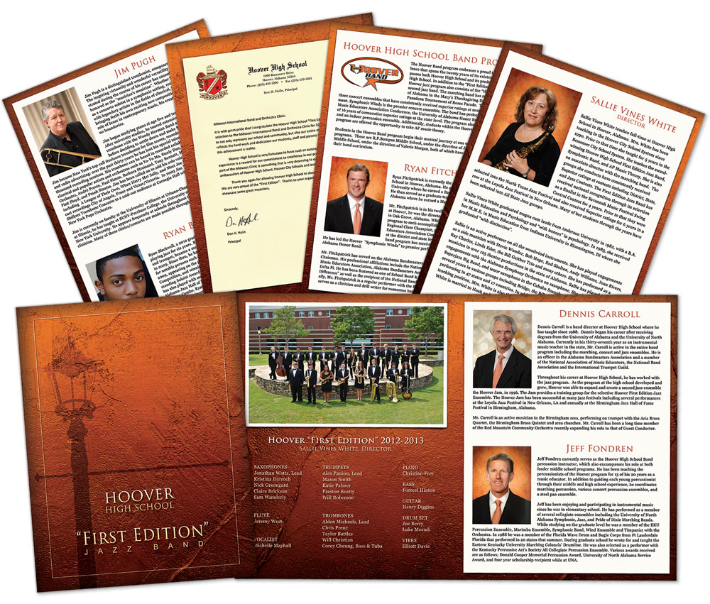
We created their 16 page program that featured information about the band, the teachers and staff, guest performers and the performance selections. The school colors are orange, black and white, but we wanted a elegant look for the occasion. We found a nice stucco textured background and gave it an orange tint, just enough to connect with the school color scheme without being to loud.

The cover image features a street lamp in shadow, reminiscent of laid back evening on Bourbon Street.

Filed Under: Graphic Design Portfolio

Seven Deadly Sins

March 13, 2015 By Harrison

The Seven Deadly Sins
The Seven Deadly Sins – Click image to enlarge
Originally, this image was created to promote the Teal Sound Drum and Bugle Corps’ 2011 production, “Sinvitation 7”. The show was set around the “its more fun to be bad than good” concept and musical selections were chosen to represent each of the Seven Deadly Sins.

The original design featured the show’s title “Sinvitation 7”, rather than “7 Deadly Sins” in this version, layered on the industrial steel, prison-like framework containing the arms of the poor guilty souls.

Each of the arms represent one of the “deadly” sins. From left to right translated into English, they are: Sloth (the limp wrist), Gluttony (fat hand with a fork), Envy (reaching out to grab what Greed is holding, a diamond), Greed (with the gem), Pride (I’m number one!), Lust (the come hither finger) and Wrath (probably about to commit murder with the knife!)

Each sin is also often associated with a particular color, shown here in the gifts of smoke probably emanating from the fire and brimstone below. Sloth = Light Blue, Gluttony = Orange, Envy = Green, Greed=Yellow, Pride = Violet, Lust = Blue, and Wrath = Red. The Latin translation of each sin is also written in its associated color.

Filed Under: Graphic Design Portfolio

HABLA Awards Program

November 6, 2014 By Harrison

HABLA Awards 16 Page Program
HABLA Awards 16 Page Program – Click image to enlarge
The Hispanic Achievement and Business Leadership Awards (HABLA) is an annual event that honors outstanding Hispanic community leaders for their contributions in business success and service. HABLA Awards also awards a 00 scholarship to an outstanding Hispanic student.

Each year we create a package of promotional materials including print advertisements, digital ads, posters and banners. We also create the 16 page program for the events which features photos and bios of the winners, welcome letters from the governor and mayor and sponsor advertisements.

Filed Under: Graphic Design Portfolio

Simmons Band Winter Concert Program

November 4, 2014 By Harrison

Simmons Middle School Band Winter Concert Program
SMS Winter Concert Program – Click image to enlarge

This simple but elegant design conveys a warm, cozy wintery feel for this annual holiday concert. The deep blue background set a soothing tone, while the stars and snowflakes play in a chilly foreground.

Classic typography and ornamental flourishes add sophistication and motion, all setting the stage for a great evening of holiday music.

Filed Under: Graphic Design Portfolio

Mac Mahon Law Ad

November 4, 2014 By Harrison

Mac Mahon Law Ad
Mac Mahon Law Ad – Click image to enlarge

This simple ad for Mac Mahon Law works well to convey to the reader the areas of practice and how to contact the firm. Since this is a print ad, we added a QR code along with the web address so readers simply scan the code to access the site.

The ad was created for a black and white publication, but this works perfectly for the formality associated with a law firm. The unmistakable Scales of Justice is all the imagery needed to identify this as an ad for a lawyer.  The gavel on the law book is an image borrowed from the firm’s website, which helps solidify the association between the website and the advertisement.

Filed Under: Graphic Design Portfolio

  • « Previous Page
  • 1
  • 2
  • 3
  • 4
  • 5
  • Next Page »

Copyright © 2025 · HARRISON MORGAN DESIGN · ALL RIGHTS RESERVED · MADE IN THE USA