Graphic Design Portfolio
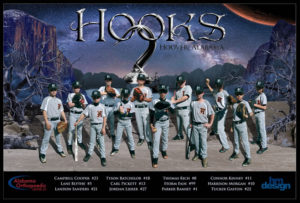
Hoover Hooks – 2017 Team Poster

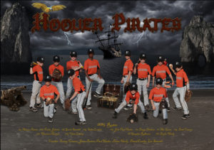
The fourth poster in a series for a little league baseball team introduced a new team with a new name – the Hooks! More pirates, but this time with a Neverland inspiration.
Multiple images were combined to create a magical, imaginary setting for this band of baseball pirates. Once again, each player was photographed separately, striking multiple poses, then placed together for the final composition, along with lakes, mountains, beaches, rocks, trees, clouds, a crocodile, Mars and the Milky Way.
The image served as a sponsor banner, and printed posters were given to each member of the team as a keepsake
More Team Posters in this series
Chubbiest Decker

Created for Zesto restaurants in Atlanta, this fun and challenging Photoshop project involved removing one slice of cheese, then adding bacon and a large onion ring to this famous double decker hamburger!
The Chubbiest Decker was created by replicating and altering portions of the existing image as well as adding elements from other Zesto burgers and stock images, layering and relayering to get the new ingredients to seemlessly nestle between the buns. A fun project to work on; and undoubtedly delicious
SMS Band Winter Concert Program
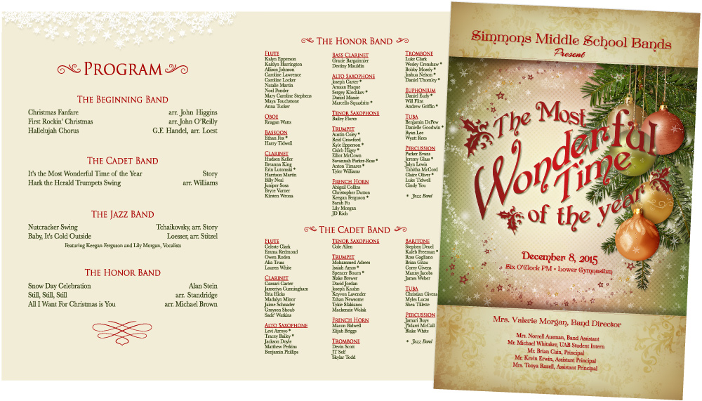
The theme for the Simmons Band concert was based on the popular Christmas tune “It the Most Wonderful Time of the Year”. The program expresses a warm, traditional feel built upon a beautiful stock background image, then layered with additional elements and ornamentations and decorative typography.
TGC Media Brochure
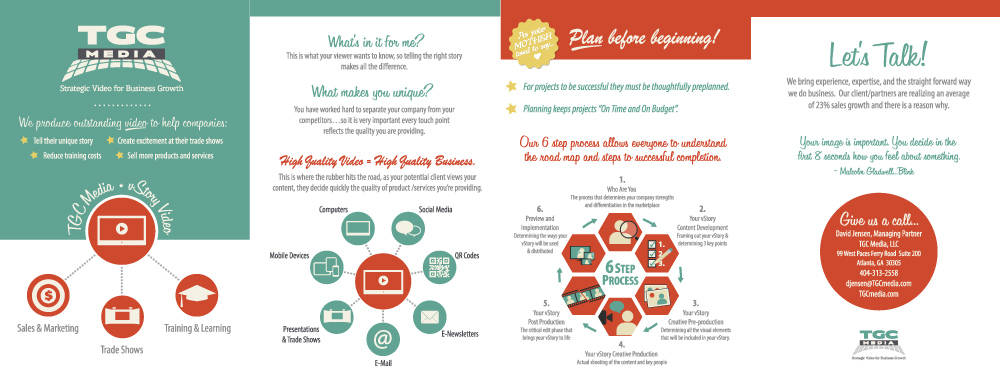
TGC Media is Atlanta’s leading provider of video production for corporate businesses. The company uses the latest in modern technology, but this brochure features a 50’s retro style as a play in contrast.
There’s a lot of information packed into this 4 page hand-out, so custom icons and infograophics help convey the messaging without being too wordy.
- 1
- 2
- 3
- …
- 5
- Next Page »